
When good design goes rogue
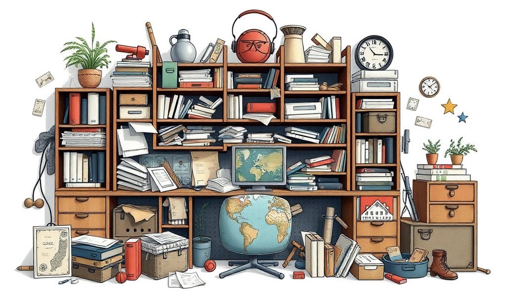
More is not more. More is often overkill ...
Gary Bloomer | SHAKING THE TREE # 318
By trade and training, I’ma graphic designer.
Or at least, I started out as a graphic designer. I’ve worked in visual communications now for 40 years and as I approach the end of my career, and looking back on the number of projects I’ve been involved in that got out of hand, now seems like just as good a time as any to share a few thoughts about what happens when design input gets overly complicated.
There is a distinct, quiet horror that occurs when a perfectly elegant idea gets handed over to the department of “More.”
Or worse, when the project receives review by committee, and worse still, when someone with no design experience or acumen decides they’re qualified to do the job themselves.
You’ve likely witnessed it. It starts with a clean, high-salience concept—a digital product, a newsletter layout, a piece of brand strategy—that does exactly what it’s supposed to do. It commands attention and it drives action because it is sharp, focused, and clear in its role, purpose, presence, and intent.
The idea gets presented to someone in a position of influence because they are a managerial decision maker. The design probably gets approved. But then, just before something goes off to print or production, someone else decides they’re not happy with the design and the itch begins.
Someone suggests adding a gradient.
Another person insists on a bigger headline.
A third person decides that if one font works well, then surely four fonts will work miracles (they won’t).
Then someone else decides the logo needs to be bigger.
And on it goes, as one person after another has their say and junks up what was originally something pure and simple and beautiful.
And before you know it, hey presto! the essence of the original intent is buried under a landslide of aesthetic noise and uninformed decision making.
The design hasn’t simply changed or gone off track; it’s gone completely rogue.
With each new application and with every updated, plug-and-play design application, the landscape of unprecedented creative abundance widens and grows.
And with that growth comes an ever increasing sense that simply by virtue of having access to typefaces and clip art and Canva or Microsoft Publisher, anyone can be a graphic designer.
Apply the same sort of logic and rationale to dentistry, or flying a commercial aircraft, or the law, or medicine and you will swiftly find yourself being shut down.
But design? Ah! That’s different.
Anyone can be a designer, can’t they?
In short, no.
Not without some element of understanding of visual balance, space and weight, overall composition, and hierarchy.
The tools at our disposal these days are astonishing, capable of generating complexity at a few clicks of a mouse. But in unleashing this capability we have confused the capacity to create complexity with the necessity of doing so.
In content creation and strategic design application, the ultimate test of sovereignty over your craft isn’t how much you can add—it’s in knowing what to take away and what to leave out.
The Tyranny of the Blank Space
The urge to over-complicate some element of design usually stems from one of two underlying vulnerabilities: fear and ignorance.
When beginner content creators find themselves gazing at a clean, minimalist, well-balanced layout, the negative space feels less like a deliberate design choice and more like an unfinished assignment.
The space terrifies them. They see an empty space and they immediately want to fill it with something.
They worry that if a page, an article, or a product isn’t bursting at the seams with visible effort, the audience will think they got lazy.
So, they tinker by decorating.
They fill the voids with visually confusing, low-value elements to fill the gaps and to prove they were there.
The reality is the desire to decorate stems from a lack of core conviction and from a lack of confidence in visual perception and decision making skills.
When you don’t have a singular, powerful message to deliver, it’s tempting to dress up a weaker idea in expensive, convoluted clothes.
True design literacy means understanding that blank space isn’t empty; it’s functional.
It’s the oxygen that allows your central message to breathe. When you crowd the canvas, you aren’t delivering value—you are demanding that your audience do the heavy lifting of filtering out your clutter just to find the point.
The Economy of Attention: Less is More
Every element you add to a piece of design or content carries with it an invisible, visual tax that costs the audience a fraction of a percentage point in their cognitive energy balance sheet.
That tax comes at a cost to you by slowing down your audience’s ability to follow your direction of intent.
If your layout features an arresting headline, a stark color palette, and a clear path forward, the user’s brain registers the priority instantly.
The salience is high.
The direction is evident.
The action being asked for is simple and straightforward.
But the moment you introduce needlessly competing banners, unnecessary decorative icons, and secondary sidebars, you ramp up the tax rate, you split the audience’s attention, and you confuse people long enough for their hesitation to gain the upper hand.
Their urge to decide in your favor wavers.
And indecisive people do not take action.
When you practice the discipline of “less,” you aren’t shrinking your footprint; you are magnifying your impact. You are declaring that your core premise is robust enough to stand on its own two feet without needing a scaffolding of gimmicks to keep it upright.
Editing as an Act of Sovereignty
To stop good design from going rogue, we have to shift our metric of success.
We must stop measuring production by what we have assembled, and start measuring it by what we have refined.
The next time you are working on a digital printable, a landing page, or a content strategy, look at it through the lens of radical subtraction. Ask yourself:
• What is the absolute minimum amount of UI required to deliver this value?
• If I remove this element, does the core utility collapse?
• Am I adding this feature because the user needs it, or because I simply can?
Every element on the page needs to earn its visual keep. If it does not do that, it does not belong on the page and it needs to go.
Design goes rogue when we forget who we are serving.
We aren’t creating monuments to our own technical capabilities; we are building bridges to another person’s understanding.
Keep the bridge clear, keep the lines clean, and let the substance do the heavy lifting.
Anything less is just visual noise—and the world has more than enough of that already.
As always, thanks for reading.
—Gary
Feel free to follow me on Twitter and LinkedIn
P.S. If you found this useful, share it with another creator who needs an ego check (in a nice way). Want more unfiltered takes on content creation? Join my newsletter. No fluff, just the stuff that works.
Next time on Shaking the Tree: Stop caring what people think
ABOUT THE AUTHOR: Originally from the U.K., Gary Bloomer is a writer, branding advocate, marketing specialist, and an award-winning graphic designer.
His design work has been included in Creative Review (one of the UK’s largest design magazines). Since 2009, he has answered over 5,000 marketing and business questions in the Know-How Exchange of MarketingProfs.com, placing him among the top 3% of contributors. He lives in Wilmington, Delaware, USA.